Press kit
Media coverage, brand guidelines and downloadable logo assets. For interviews, quotes or high-resolution files, reach out via the contact page.
How to refer to me
A few editorial guidelines, so the wording stays accurate.
Name
Lenny Obez
Obez, Lenny Ind. (the legal name, for invoices only)
Descriptor
Senior full-stack web developer and photographer, based in Huy, Belgium
"agency" or "studio" (this is a one-person independent practice)
Disciplines
Development, photography, exploration
Reducing the work to a single label
Tone
Factual and plain
Empty superlatives and jargon
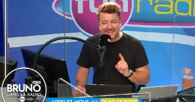
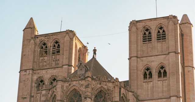
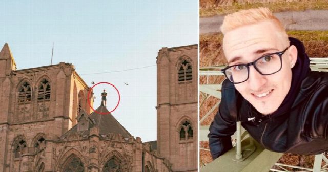
As seen in
A selection of media mentions.
-
-

-
-
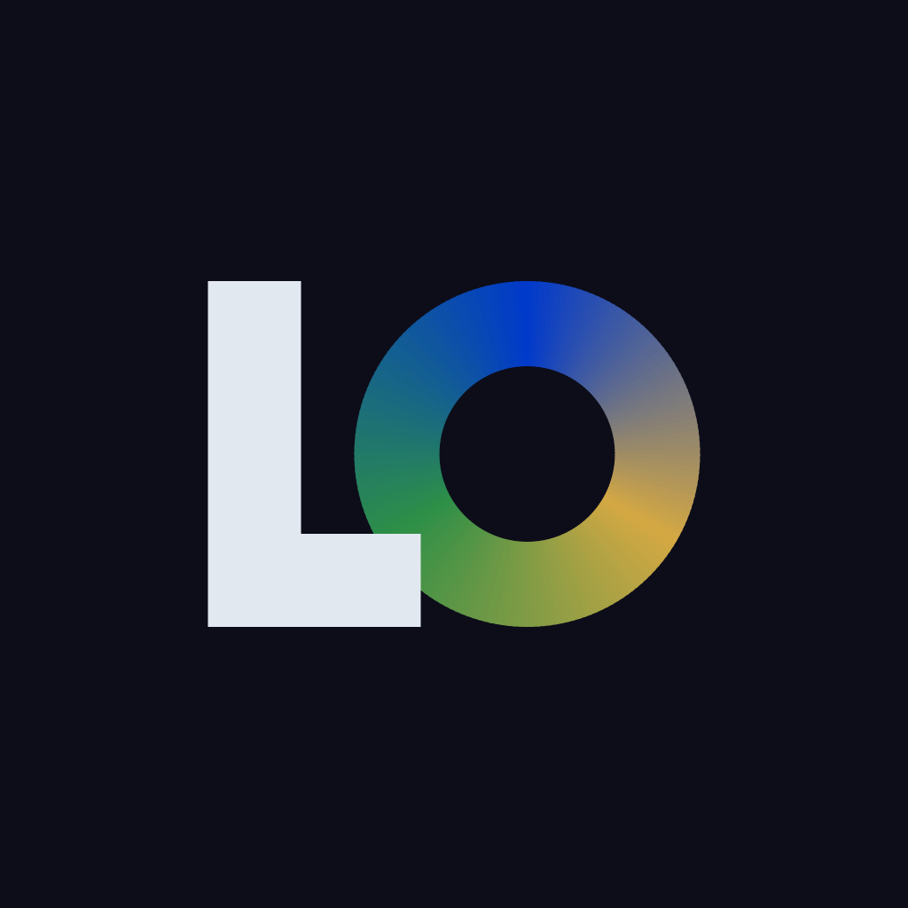
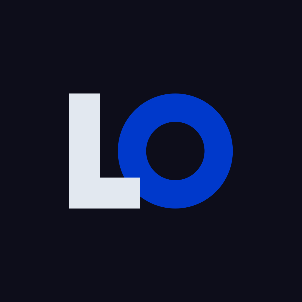
The mark
The logo is an "LO" monogram: the "L" for Lenny, the "O" as a ring for Obez. The combined version sweeps the three worlds around the ring (blue development, amber photography, green exploration) and is the primary mark, used on the Google profile. Each world also exists on its own.
Each mark comes as SVG (vector) and PNG (1024 px) on Precision Noir, plus a transparent SVG for any background.


Clear space and usage
Keep free space around the mark at least equal to the height of the "L", and use the SVG for large formats.
Do
- Use the dark-background version on busy backgrounds.
- Keep the original colours and proportions.
Avoid
- Recolouring, distorting or rotating the mark.
- Adding shadows, outlines or effects.
- Placing it on a background that hurts legibility.